
How do you say postcard?
I don’t mean “How are you supposed to say it?” I mean “How do you say it?” I know how we’re supposed to say it. The citation form, as linguists call it, is /ˈpoʊstˌkɑrd/ (or, with a standard British accent, /ˈpəʊstkɑːd/). But that’s not the everyday form of it. Listen to yourself say it: you almost never say the /t/ in there.
Which is fine. It is thereby uttered more efficiently, which is also a point of using postcards: they are smaller and lighter and more quickly sent, supposedly. They also limit the text that can be included, thereby reducing the burden on both sender and receiver. As a message a postcard is a quick salutation, a social nicety nicely discharged. Postcards are lately increasingly displaced by Facebook and Instagram and Twitter, but there’s still something about physical evidence – and a tangible, durable, non-ephemeral form.
The evidential nature is key to a postcard. It says you were there. And it shows where there is, what it looks like. Not what it looked like to you when you were there, though. Not what you would have taken with your own camera (cell-phone or otherwise). Look, you just can’t get a good shot without all those doofuses (doofi?) and their stupid cars, cars, cars in the way. (If there are people or vehicles in postcards, it’s because you can always expect to see some people or vehicles there and these ones are no longer individuals but tokens standing for a general type – postcards are the opposite of reportage.) And the light is wrong and the sky is wrong and blah. This is one reason people still buy postcards even if they seldom mail them to anyone: the photos you take on your trip, no matter how good a photographer you are, will never be as perfect as postcard pictures, nor as close to memory. Besides, you’re busy taking pictures of your family and friends standing in front of the things you’re there to see. Evidence, remember? But a postcard shows what it’s supposed to look like. A typical view. Its citation form.
Except that postcards take on the aspect of memories, and we know that memories distort, exaggerate, simplify. While the uttered forms of words are generally reduced from their citation forms, the citation forms of places are typically reduced from their experienced forms: vivid and uncomplicated.
Vivid and uncomplicated. That is the essence not just of the subjects and compositions of most postcards but also of the colours in them until more recent decades. I’m quite fond of old postcards – I don’t collect them, but I love seeing them online on sites such as messynessychic.com. And they have a look that stands out. The colours are often somewhat faded and yellowed with age, but you can still see that the exigencies of inexpensive printing in quantity meant that the inks were very contrasty, and so the blacks are often a bit thick and punchy, and the colours are vivid and uncomplicated. There’s a lot of colour but not a lot of subtle variations in the colour. In technical terms, they’re very saturated but lacking in colour depth. The earliest colour postcards are even more so: they were black-and-white photos with colour added, so of course the colour doesn’t have a lot of detail – the black ink gives all the detail.
Another feature of many older postcards, usually absent from more recent ones, is captions on the pictures. Oh, you can buy postcards with very splashy florid writing proclaiming Miami! for example, but the older ones had more detailed captions, sometimes even whole sentences, printed on the picture or beneath it.
So. On the front you have the vivid and uncomplicated citation forms of the sights you see. There may be a pithy statement. On the back you get to write some anodyne distillation or simple evidentiary salutation. The contents vary; the classic is “Hawaii is fun, wish you were here,” but my personal experience ranges from one relation who, on at least one occasion, copied text from a tourist brochure just to have something to write, to another relation (an extremely close one, often inches away) who has at times fit 200 or more words of travelogue on a standard postcard.
As may be known, I like taking pictures. I decided lately to do a series of photos of Toronto done up somewhat like old postcards, with the simple colours, the contrasty blacks, the aged look, the on-photo captions. Because why not. I also kept strictly to a 4-by-5 size, although I did allow some of them to be vertical (a little bit of a cheat). I put a number of them on my Flickr on Saturday. On Sunday I went to the Art Gallery of Ontario and found – and bought – a little book of mid-century postcards of unremarkable sights around Britain, titled Boring Postcards. It was obviously meant to be.
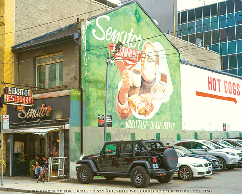
Here are a few of my postcards from Toronto. The captions may be slightly different from the classic style. Oh well.