Author Archives: sesquiotic

focus

The focus. It burns.

Focus a magnifying glass on a piece of paper and let the sun make a little image of itself. So bright, so hot. Smoke soon rises.

Focus a camera lens on a subject. With the iris wide open, the subject is sharp, striking home, blazing itself into the film or sensor, and all else around it is softening into the balls and blurs of bokeh. It is like the word focus: soft at the peripheries (/f/, /s/) and sharp in the centre (/k/).

With the iris tighter, more appears in focus; you get more picture, more context, but more distraction too – more in focus makes it less focused.

With the iris too tight, nothing is quite sharp but everything is equally in focus and equally diffracted. You see all equally clearly and nothing quite clearly enough.

I have a lifelong ambivalence about focus. I like seeing things clearly and sharply. I have worn glasses since I was twelve, and I have a desire to make out small details in the same way I have a desire to understand motivations: I yearn because I am not good enough at it. But too much focus traps me, imprisons me. I cannot sustain single-point focus on a thing for too long without bursting into flame. I need to be elliptical…

An ellipse, as you may know, is a geometric figure with two foci; it is defined as a line such that the sum of the distances to the two foci is always equal. Stick two nails into a board and tie a piece of string to them, one end to each, that is somewhat longer than the distance between them. You can then use a pencil to draw an ellipse simply by keeping the string taut as you move the pencil: always the same sum of distances, the length of the string. Not one focus, two foci – the two nails. Other figures also have two foci: a parabola is an ellipse with one of the foci at infinity; a hyperbola is a curve such that the difference between the distances to the foci is always the same. A circle is an ellipse where the two foci are in the same place. It has a singular focus. It is perfect, contained, cold. But hot in the centre.

When I take photographs, I like to have something in sharp focus most of the time, and other things out of focus.

Sometimes I like to look at something very small and see just the smallest part of it in focus, a still moment of the eye and mind on the edge of dreamland and release. And the closer it is the less of it is in focus.

But I like to shift focus. Sometimes I like to have many things in sharp focus so that I can move my own focus around as I look at the picture. Keep things at a distance and you can focus on them without being threatened by the intensity of so much intimate detail.

Sometimes I like to shift focus in the act of taking the pictures, from one picture to the next.

Sometimes I like to let the focus go a bit. Erase the wrinkles of life. Soften the colour, add to the mystery. The seeing eye sees a little less.

Let it go even more. Like a dream. Let the burning ease. Abstract.

Sometimes I like to focus on something peripheral and let the real object of interest remain an obscure object of desire, lest it gorgonize me.

The geometry of attention and re-presentation. The circle of attention. Ellipses. Parables. Hyperboles. Through what lens – or what lenses – do you focus?

The first person to use focus in geometry was Johannes Kepler, a man familiar with optics. It had already been in use to refer to the point where a lens makes an image of the sun on a surface. That hot little point. The place where it strikes home, the heart, the furnace.

Focus: Latin for ‘hearth, fireplace, home’. Its modern Italian descendant fuoco means ‘fire’.

It burns, the focus.

clathrate

There’s something vaguely Celtic or mythic to the sound of this word. The /kl/ and the /θr/, with their voiceless-liquid combinations – one crisp, the other soft – are reminiscent of Tolkien’s elvish tongues. It has such odd old echoes: cloth and clash, threat and thread and maybe threnody, lath and rate. Is it a ruling council? A clan of druids and mages? Perhaps a prison, an ancient cage holding a noxious thing awaiting its release after millennia to issue forth as a destructive vaporous spirit once the bars melt away?

That last one, yeah.

Well, it’s more than that. A clathrate, generally, is a molecular cage: the crystalline lattice of one molecule traps within it another molecule. The word clathrate comes via Latin clathri ‘lattice’ from Greek κλεῖθρα kleithra ‘bars’. There are many molecules that can cage and many that can be caged. But perhaps the best known and most feared clathrate is a cage made of water – the hard expansive lattice of ice, like microscopic geodesic cages, less dense than the liquid – containing as its prisoners, one in each cell, molecules of methane.

Chemists say that the methane is the “guest” of the water clathrate. This is rather like calling General Zod a guest of the Phantom Zone in the Superman movies. The methane is a gas, but when it is caged in the icy clathrate it is frozen in place, like suspended animation or consignment to another dimension. Waiting.

Where do you find such clathrates? Under the seabed and in the permafrost. And if and when these long-frozen beds thaw, the methane is released. It can build up pressure and explode, as happened recently on Russia’s Yamal Peninsula, making a big hole in the earth, as though some ancient beast had broken free. Or it can simply, insidiously, bubble up. And when it is loose, where does it go? Into the atmosphere. Where it can be a potent agent for further warming the planet… to release more of its friends…

But a cage of suspended animation does not always contain an enemy. Han Solo was kept in suspended animation, a masculine Sleeping Beauty. And our own minds are clathrates of memories, thoughts and images and feelings long locked up in the permafrost of passed years. Perhaps it’s just a coincidence that clathrate sounds a bit like classmate and I was at a high school reunion this past weekend, seeing some people for the first time in 30 years. Ah, memories. And we had a gas!

The Grammarist interviews me

The language-oriented website Grammarist.com has published an interview with me about my views on words, blogging, et cetera. If you would like to read it, it is at http://grammarist.com/interviews/interview-with-james-harbeck/ . Previous interviewees include Constance Hale and Mignon Fogarty.

Explaining the exploitation of explicit expletives

Do words have “bad apple” effects on other words by sound resemblance? Mmmmmaybe. If they do, one possible case is the subject of my latest article on The Week:

How did ‘expletive,’ ‘explicit,’ and ‘exploit’ become such sleazy words?


quad

Iva Cheung, walking through the quad at Simon Fraser University, asked herself why the open yards of universities are called quads. Yes, yes, of course it’s short for quadrangle, but we don’t speak of Times Quadrangle, do we? Are university quadrangles notably other than square or at least rectangular? Can other parallelogram or even rhomboid college quads be found?

Mm-hmm, yes. It takes some looking, but in fact they can.

Most North American universities that have grassy areas called quads do indeed have rectilinear borders, although there are some notable exceptions – have a look at the Freshman Quad at Johns Hopkins University. A quad is, originally and tout court, a yard bordered by buildings at an educational institution, but these days we may be inclined to reserve the term for those actually so named, such as the residential and academic quads at my graduate alma mater, Tufts University (the academic quad is shaped rather more like a flattened stuffed duffle bag). However, those are more loosely quads in another sense: they are not actually fully walled in by buildings, as was originally the case – quads were first of all courtyards. They have buildings around them, yes, but gaps too, just as Harvard Yard does.

One good place to find odd quads is Oxford University. One of the oldest quads is at Merton College, Oxford; it is a bit of turf that was over time enclosed by student residential buildings. The grass came later, as did the now-common name for it, Mob Quad. But there are quite a few quads at Oxford. And, thanks to the non-rectilinear street layout, some of them are a bit off-kilter. Have a look at Oriel College, for instance.

So, again, why quad? Well, given that a square is a town meeting place (so the name is a bit common) and a square formally must have equal sides, and given that a rectangle must be perfectly rectilinear, and given that a university is a high-toned place where one at least used to study Latin and even study in Latin – study the great avenues of the trivium and quadrivium – quadrangle seems entirely apposite. It’s a technically correct architectural term, so there.

And given that the toffs who have long been the key denizens of Oxford and its sister Cambridge have had a habit of jauntily truncating Latin words (e.g., mob for mobile vulgus) – but only inasmuch as it would not be infra dig, you know – quad is very much to be expected.

But the truncating toffee-noses are not the only ones to trim a Latin term, and the open-topped parallelepipeds of Oxbridge are not the only things called quads. There’s a whole squad of quads, in fact. In typesetting (and don’t say “what’s that,” even if almost no one does it literally anymore), a quad is a quadrat, a square block of metal used for filling space; in telecommunications it’s a quadruplex, a set of four wires twisted together; obviously in housing it’s also a quadruplex; in some British colloquialism it’s a horse, because a quadruped; in boat racing it’s a large four-sided jib; it’s also the quadriceps muscle, which are those massive things that make up the tops of your thighs (I run, so my quads are my best muscles; you can also build your quads by doing squats); a quad is also a quadruplet or a quadriplegic. Which means that the quadriceps of a quadriplegic quadruplet who lives in a quadruplex on a quadrangle are a quad quad’s quads in a quad on a quad.

Oh. My. Quad.

But now here’s one for you. What is a quad when viewed from the other way?

Why, it’s a panb, of course. Turn it around and you’ll see.

After Colville

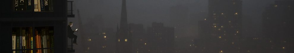
The title of this exhibition of new works, “After Colville,” refers both to the fact that the photos were taken by the artist immediately after viewing an exhibition of works by Alex Colville and to the evident influence of Colville on the works themselves: in their mood and composition, they may be seen as a sort of homage to Colville’s work – “After Alex Colville,” as a museum placard would say. The title is also a reference to Tom Stoppard’s play After Magritte, an absurd and comical piece of theatre that avails itself of the same ambiguity. The artist himself performed in a production of the Stoppard play when he was a university student. The photographs and their commentary are also intended to raise questions of the interface between viewer and art and of the very place of art in modern life and the role of the gallery as an institution in an era when artistic production is a widespread recreational activity and the technology of small portable cameras supplants for many the essential quiddity of the carefully crafted artistic object, and they also form a critique of the verbal framing of art by placards in galleries.

IMG_1993_a

IMG_1993_a
Photograph
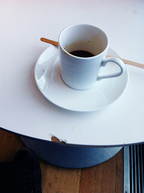
This first image presents us with a simple yet timeless ritual: the consumption of a small cup of perfect coffee in an artistic surrounding. The artist chose to represent the stimulation of viewing Colville’s art through the consumption of a stimulating chemical, caffeine. This image brings to mind previous similar photographs he took on earlier visits, with other cups and tables. The composition deliberately echoes the tight geometry of Colville’s careful paintings. The human figure that dominates each of Colville’s paintings is nearly absent here, however, represented only by one barely visible shoe (the artist’s own). The artist presents himself simply as a foot walking through the gallery, and an eye (that of the camera, echoed by the coffee cup). We are challenged by the erasure of the true human element: Colville’s paintings are of and by a human, but this photograph is from an era of electronics and objects when our very humanity is always already in erasure through overexposure via its hyperreal hyper-representation in “selfies.”

This photograph, like all the images in this exhibit, is named with a modified version of the image file name. The name format is a standard one and suggests to the viewer that the photograph was taken with an iPhone, that ubiquitous chronicler of modern anomie and narcissism. The artist, in this choice of medium, parallels the flaw in the edge of the table, suggesting a crack in the pristine surface of modern aesthetic life and the ultimate disposability of our images and experiences, just as the table itself is sure to end up in a landfill and probably sooner than later. The added “a” on each image name is a personalization and may stand for “altered” or “after” or perhaps, as with highway names (such as the Highway 1A that ran through the artist’s youth), “alternate.” The artist notes disingenuously that “I took the photos with an iPhone because it’s what I had with me,” reminding us that the logic of aesthetic preference is, like the coffee cup, inevitably circular.

IMG_1999_a

IMG_1999_a
Photograph

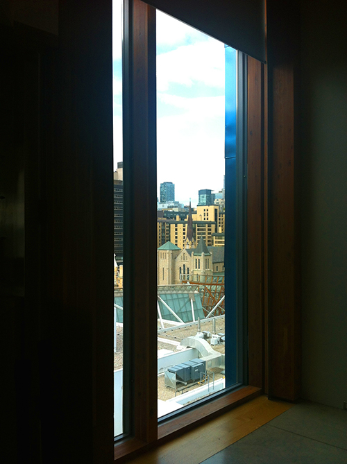
This photograph was taken through a window in the “tower” section of the Art Gallery of Ontario, on the fourth floor, where modern art is exhibited. The artist notes, “In the past half year the art exhibits up there haven’t changed any more than the view has.” The image presents the viewer with a juxtaposition of curves and straight lines, old and new; the angle of the window reminds us of perspective, which is not only a key element in representational art and mathematically important in Colville’s work but is also essential to the art viewing experience itself in that every viewer brings his or her own perspective. Colville’s work often presents an interface or conflict between the traditional and modern, and is tightly composed and cut off at the edges. This image would never feature in a Colville work, however; it is much too busy and it lacks a human presence. We see windows here, which present openings, but there are no people visible; the artist engages us with the perennial modern question: “Where is everybody?”
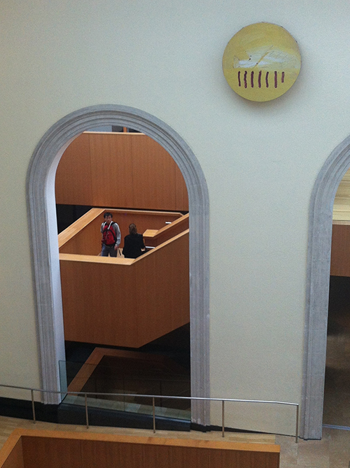
IMG_2002_a

IMG_2002_a
Photograph

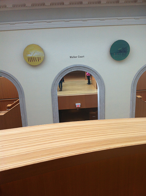
The tilting and slight curvature of straight lines in this image make the viewer feel disoriented and slightly queasy. The artist has not corrected the barrel distortion present in the very-wide-angle iPhone images, and the slight tilt suggests haste, unsureness, or carelessness. The two figures in this photograph are presented only as legs, again as though the role of the viewer in an art gallery is only an ambulatory one: the seeing and thinking part of the person is erased, eclipsed. This is reinforced by the sign on the wall, “Walker Court.” The swath of wood across the front is the top of the containing wall of a curving staircase on which the artist was standing while he took this picture. The viewer is invited to consider the possibility of climbing over it and falling to the unseen floor below: the ultimate death for art. And yet the two unidentified artworks perceptible in this image look on as dispassionately as the sun and the moon.

IMG_2003_a

IMG_2003_a
Photograph

This photograph presents an encounter, but we do not know its nature. Is it a chance passing, a conversation, a confrontation? Arrangements of two figures are common in Colville’s work, sometimes with the face of one of them not visible, leaving us to follow the unseen gaze and reflect on questions of mortality and morbidity.
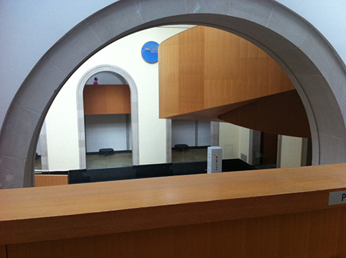
IMG_2006_a

IMG_2006_a
Photograph
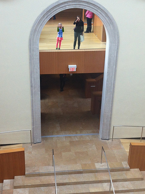
In this photograph, we are both charmed and saddened by the mother-and-child pair. The child clings to the glass, for protection or with the aim of escape; meanwhile, the face of the mother is partially obliterated by her gesturing hand, pointing to questions of the effacement of the human person of a parent by the role of instructor. We cannot see what she is gesturing to, so we are invited to bring ourselves into the picture and view from her angle. The pink-jacketed person from IMG_2002_a is present again in this image; she may be museum staff, but she is looking away. In the doorway below the pair, we dimly glimpse a male body entering the frame: he is headless as of yet, a disembodied pair of legs representing the oncoming masculine dominance of the spectator-as-headless-ambulator to override the thoughtful feminine role. The daughter will soon have her eyes obliterated as the mother’s are, and ultimately will become a decapitated denizen of the institution of art as the pink-jacketed person is. This photograph was taken from the same position as IMG_2002_a, so we know, given the fixed focal length of an iPhone lens, that it has been cropped. The cropping of the top of the arch recalls the cropping-off of architectural elements in Colville’s work and the decapitation of the institutional bodies in this picture.
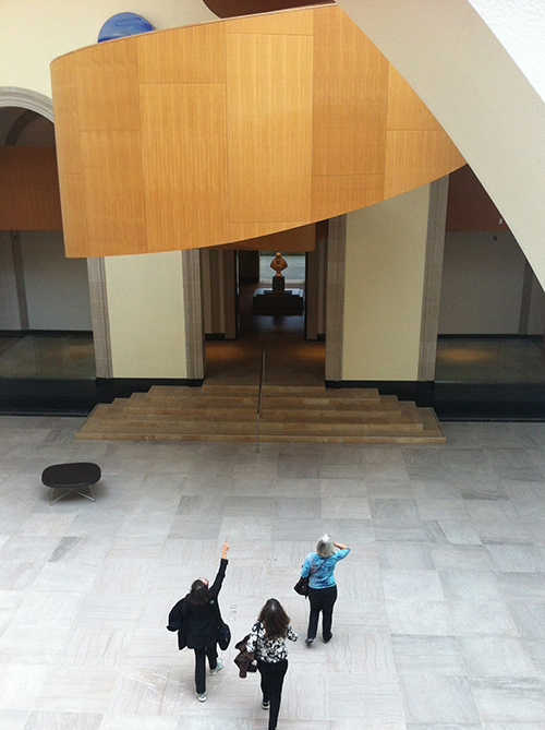
IMG_2007_a

IMG_2007_a
Photograph
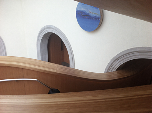
This image is one of only two horizontal images in this exhibit. Horizontal images, once the default for photographs, have become the exception in images taken by mobile phones due to the standard orientation in which one holds them and the tendency to use them to take pictures of people. The sensuous curves in this image belong to the same staircase as is hinted in IMG_2002_a, a staircase designed by Frank Gehry for the museum’s expansion several years earlier. The photograph thus becomes an appropriate of the architect’s work into the photographer’s oeuvre, reminding us that architecture is not considered by many to be a fine art and inviting us to take part in its “legitimization” through re-presentation. At first, this image appears to be devoid of human figures, but the dark dome in the lower left quadrant, in front of the railing, on closer inspection is revealed as someone’s head. In this way we are shown how enveloping and containing the high walls of the staircase are, a preventative against hurling oneself over and into the void, but at the same time the person is headed towards a void: the forbidding dark archway on the right. The eyes are again invisible, calling into question the legitimacy of the act of viewing and also telling us that the person could not see that he or she was being photographed. The artist notes that “unlike a regular camera, an iPhone has the bonus of being silent when it takes a picture, so it’s possible to be entirely surreptitious and not disturb people or alert them to the fact that they are being photographed, which could affect their behaviour.” In this way he again implicates us in the scopophilia of the gallery, where humans become stalkers of the aesthetic image and of each other.

IMG_2010_a

IMG_2010_a
Photograph
This image swirls with curves interplaying with straight lines in perspective. Some of the curves are from the arches in the old architecture of the building, and some are from the newer curving staircase, which is the staircase on which the artist was standing when taking pictures IMIG_2002_a through IMG_2007_a. The careful and cropped composition echoes the compositions of Colville’s paintings. In a Colville painting, however, we might see a figure in the foreground, and perhaps a gun on the wooden surface; here, we see only a distant figure carefully placed on the left side of an archway, looking upward as he walks. On the right side, a sign is cut off at the letter P. Is this for Presence, or Perspective, or Photography? Or is it the beginning of the word Please, as in (perhaps) “Please do not place handguns on the ledge”?

IMG_2016_a

IMG_2016_a
Photograph
This image presents more cropped curves, a consistent theme in this exhibition. It is much more human than the others, however: it shows three women in full figure, one gesturing forward, one holding her hands to her eyes, the third just entering the frame. The cropped-off foot of the bottom figure repeats the theme of cropping present throughout this exhibit, and may be a repudiation of, or answer to, the disembodied foot seen in the first photograph of the exhibit. It is answered by the bust in the centre of the photograph (a bust of a pope, identified in recent years as a Bernini and consequently moved to a place of pride), which has very the top of its head cut off by the door frame. The triangular composition of the three women is reminiscent of the careful geometry of figures in Colville’s paintings. The artist invites us to join these women to enter and explore the gallery – but is the incipient decapitation of an old paternal religious figure a portent of what will become of them?

IMG_2018_a

IMG_2018_a
Photograph
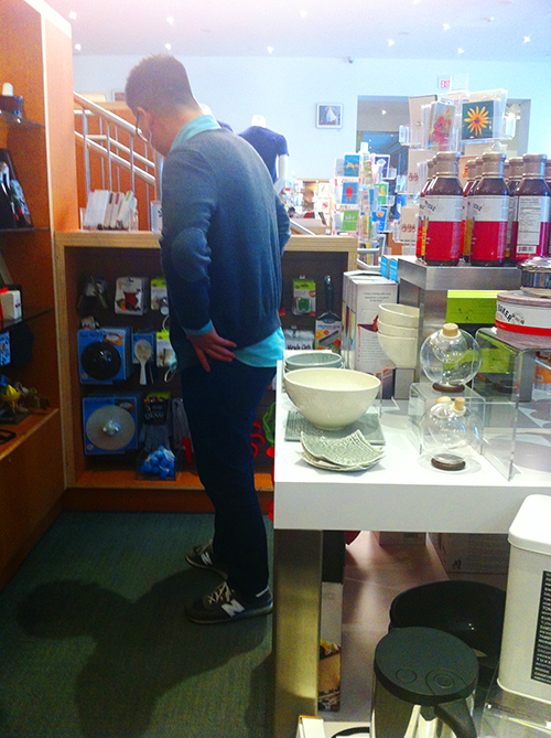
This photograph was taken in the Art Gallery of Ontario shop. It prominently features kitchenware and other housewares, which may seem out of place in the store of an art establishment; it asks us to consider whether there is a true dividing line between the aesthetics of houseware design and that of paintings and sculptures, two realms that may be joined in the middle by the ostentatiously aesthetic yet functional architecture of the Art Gallery of Ontario edifice itself as seen in the previous pictures. The colours have had their saturation enhanced, as though the world of functional objects is more vivid than the etiolated and withering sphere of the pure aesthetic object. The image features a strong single figure, as in many Colville paintings; he is facing away from the camera and apparently unaware of his role in the aesthetic production, simply a faceless mute personage, deafened to the world by his headphones, who might as easily have wandered into a housewares department and looked up to find himself in an art gallery, wondering what the difference was. The human figure partially conceals a mannequin bust, which brings to mind the first painting that Colville felt was truly successful, showing his wife looking out an attic window while a mannequin bust dominates the foreground. The glow at the top of the picture invites us to the heaven of consumerism while at the same time reminding us that we are in the world of the real and dirty – we may assume it is present due to smudging on the lens of the phone, which is heavily handled.
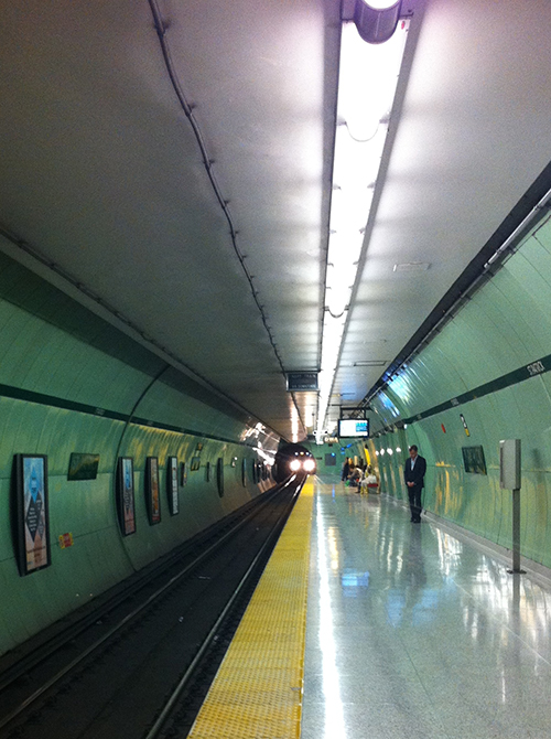
IMG_2032_a

IMG_2032_a
Photograph
In the last image of the exhibit, we find ourselves entirely away from the gallery and into the real world that the art supposedly represents. This is St. Patrick station on the Toronto subway, the closest station to the Art Gallery of Ontario. The photo of an oncoming subway train taken from the platform is one of the great clichés of Toronto urban photography, but at the same time it too recalls Colville: the obvious and perfect perspective, the pensive figure in the foreground, a hint perhaps of the horse and train from Colville’s most famous painting (which appears in Stanley Kubrick’s The Shining). We are unsettled by the anomie and the faint suggestion of suicide. At the same time, there are people in the background, a normalizing presence reminding us that a person walking around with a cell phone cannot always control all elements of the composition; as pure as it might have been not have had them there, the photographer could not exactly shoo them away, and he did not wish to digitally alter the photographs – other than adjusting the colours and levels, which leaves us to ask ourselves whether those privileged silent alterations are less altering than the erasure of other details.

An overall note about the exhibition 

The presentation of the text in the captions for the artworks contains many sections in strikethrough, a style that preserves legibility while at the same time signifying deletion. This presentation imbues the work with a chill of censorship and a suggestion of the evanescence of the written word, and it begs questions not only of the “legibility” of artworks themselves but of the erasure of the critical voice, the disappearance of the reflective approach to artwork in a time when so much is dictated from “above” and the the curator’s presence is not only obsolescent but in fact always already self-erasing at the moment of utterance through the perpetual requestioning of thought. It can also be seen as an expression of the artist’s view that “there is a lot of onanistic bullshit written on gallery placards that doesn’t enhance the understanding or appreciation of the artwork for anyone other than the people who write it, and possibly not them either. Interpretation of artwork is an enjoyable sport, but it’s a game that each viewer should get to play for him or herself over and over. Some placards are like fully-played gameboards lacquered into place: the critic has had his fun and you don’t get to. I’d prefer to know details of the context and material and the work’s place in the artist’s oeuvre, things that help me understand it better, and maybe get a few thoughts on the content presented as simple suggestions, and not be told what I’m looking at or how I’m reacting to it. Also, sometimes they just use too many words.

kerfuffle

Oh boy, did Toronto have a big kerfuffle today. A flurry, a fluttering, kaboom, kerplop, kabibble, kerflop… anything other than a careful card shuffle. Between 1 and 2 in the afternoon: Mayor Rob Ford dropped out of the mayoralty race. His nephew withdrew from his candidacy for councillor. Rob’s brother Doug – after difficulties with the paperwork – registered to run for mayor. Rob registered to run for councillor in his old ward, where Michael had just dropped out. And Michael registered to run for school trustee. My Twitter feed was scrolling like the electricity meter on the side of a house that was hosting a party in March for fourth-year university students.

Ah, kerfuffle. Such a good word. It sounds like a cat that has accidentally slipped on a stack of papers while padding across a desk and has fallen in the shuffling fluttering folio foliage to the floor. What you know for sure is that something has abruptly gone off the tidy norm and much ruffling has followed. Even the shape of the f’s in this word gives a sense of floppy things flapping and flipping.

So where did this word come from? Yes, yes, imitative, I know. But there are many ways to imitate the kind of set-to, to-do, ruckus, hurly-burly, hoo-hah, or whatnot that this word signifies. So why kerfuffle? Well, we know that the ker- is common enough; we see it on kerplop, kerflop, kerslosh, kerthump, and so many others, and its related ka- on kaboom, kabang, kapow, and so on. It’s the backswing on the action of the verb, the backdraft before the explosion of fire. But this word did not begin its life as a ker- word.

No, kerfuffle is a modified version of curfuffle or carfuffle, matched by analogy to all those other ker- words. Curfuffle comes from Scots English; as a noun, it dates from the early 1800s, but there is a verb curfuffle that is seen as early as the late 1500s. It means (per the Oxford English Dictionary) “to put into a state of disorder; to ruffle,” and it is born (with maybe a little Gaelic help) from simple fuffle, a verb, which means, again from Oxford, “To throw into disorder; to jerk about; to hustle, treat with contumely.”

Which makes the word kerfuffle even more perfect for the disorder, hustling, contumely, and jerking about that took control of the Toronto news stream for some time today.

tome

I pick the book up, its age-softened cardboard covers sweating dust, its linen pages foxy and feathering. It takes two hands to hold it. I carry it to the table and release it; the sound when it hits is percussive, then resonant: “tome.”

Tome. It is a grave word; it has the consonants of tomb and the vowel of stone. A tome is a book with the weight, size, and gravity of a tombstone; it is a hefty tome, a weighty tome, a heavy tome, a massive tome, a ponderous tome. It is also a dusty tome and a leather tome. A tome is the physical, bibliotechnical evidence of time; the candlestick of live words i in time is burnt down but leaves its fat printed wax o and that is this tome. It is the epitome of weighty learning, the last word in first words. Its morphemes lodge in your eyes as motes. It is age; it is words; it is paper; it is volume.

Yes, volume. A tome, in the first place, was a volume of a multi-volume work. It comes from Greek τόμος tomos, from τέμνειν temnein, verb, ‘cut’ (also the root of epitome, originally a cut-down account – a brief abstract). This is a sixty-four-ounce steak cut from the side of a beefy work. But we will not now call a paperback copy of one part of a trilogy a tome. A multi-volume work, in this image, is a great ancient encyclopedia, an august authoring imprinted in folio format. In modern times, of course, the requirement that it be but a part has been cut. Any two-hand book will serve.

This is a word kept in reserve for special occasions, a word that hangs in the closet next to your formal wear. Use it too much and you may tame its tone, but at least as likely you will simply look like a guy who wears a bowtie to a frat house party. Actually, I must confess, this word seems to me already somewhere in that direction: no more a genuine morning coat with tails or proper dinner attire; at best the adjustable rental waistcoat with elastic straps, and at worst the T-shirt with the waistcoat and tie printed onto it. It is used almost entirely by those who wish to assume on the moment an air of gravitas without having earned it. It serves as verbal clip art for journalists and feature writers and jokey friends and co-workers: “That’s a hefty tome you got there.” The word is a whilom duke’s carriage now pressed into service giving rides at a petting zoo.

Well, no mind. I have my tomes, and they are suitable to me.

Seriously, what’s the problem with sentence adverbs?

Originally published on The Editors’ Weekly

The English language is a very complex and powerful thing, capable of many nuances and quite resistant to simplistic attempts at tidying it up. Sadly, not everyone realizes that. Worse still, many people take very narrow and inconsistent views, focusing on pet peeves while letting parallel instances of usage pass unnoticed. It’s as though a self-trained self-appointed “master chef” opened a cooking school and taught, among other things, that salt and anything containing sodium can only be used in savoury dishes, never in desserts. The cakes may all be horrible and heavy and the puddings insipid, but goshdarn it, they’re culinarily correct!

Adverbs give us a good example of this. “An adverb modifies a verb,” some people say, “so it must always directly modify the main verb of the sentence. If someone says ‘Hopefully, they will be here tomorrow,’ it can only mean that their presence here will be hopeful.” And yet the same people will not be seen declaring that “Seriously, it will be very amusing” must mean that it will be amusing in a serious manner, or that “Frankly, you’re being evasive” must mean that your evasiveness is frank, or that “Clearly, someone has muddied the water” must mean that the water has been muddied in a clear manner.

If the “hopefully” peevers were to take note of how these other sentence adverbs function – using the adverb to give an attitude or setting for the entire sentence – they would be forced to allow the same role for hopefully… or perhaps they would decide that all those uses must be wrong, well established though they are (some date from the 1600s). But let’s say they allowed them. The next thing the forced-tidying mind might do – like the robot maid tossing out both the cat and the master of the house – is decide that only single-word adverbs can fill this role. Never mind that one may modify the action of a verb with prepositional phrases and participles; they’re not adverbs, so (the reasoning might go) they can’t be used as sentence adverbs. Sure, you can say “Hypothetically, he could resolve it with a clear statement of fact,” but you must not say “Speaking hypothetically, he could resolve it with a clear statement of fact”…!

Now, of course, there’s a perfectly good reason not to use the latter sentence – it has an ambiguity that could make the reader snicker (I like to say such sentences have a high SQ, or snicker quotient) – but ambiguity (and high SQ) is not the same thing as grammatical error. There are many instances of prepositional phrases, participles, and infinitives being used to set the scene for a sentence: “To give an example, he is disinclined to use illustrations”; “Going forward, all cars on the ferry must have their parking brakes on”; “Among other things, it is located on an empty treeless plain”; and so on. These do not generally raise the ire of the particular – although some can be awkward – and they are not ungrammatical.

Hopefully, as editors, we have eyes more finely tuned to such structures and can discern the many places and cases of their use. Going forward, I would like to suggest that we all keep our eyes open for every instance where an adverbial construction of any sort is used to give a setting for the entire action of a sentence rather than to modify the main verb directly – and, if we dislike it, ask ourselves whether it is truly ungrammatical or simply ambiguous. You may find yourself having to come to some surprising and possibly discomfiting conclusions.

staple

A staple item is an essential, something that holds your life together. Sort of like a staple holding sheets of paper together.

Thirty years ago, starting university, I bought a stapler and a box of staples. I still have the stapler; it looks almost new (as many things and people do at 30 years of age). I still have the box of staples too. Haven’t finished it yet. But when I need it, I need it.

Some things can be staple items and yet not get used often.

Later this month I’ll be going to a 30th anniversary reunion for my high school class. It will be the first time I will have seen most of the people there since we graduated, though from their Facebook pictures I can see they seem to have held up well. I do not think we will all just pick up where we left off. Actually, I hope we won’t; we’re more mature now, and I for one have no intention of being the dweeb I was then. We’ll all be back in Banff, a place I only get to every year or two now – but a place that is still essential for me. It’s reasonably stable, though it changes, and it is a staple of my existence: it’s holding the sheets from the 1980s together with the sheets from now – and years to come.

A staple is something stable, or something that keeps you (or other things) stable. Or both.

Are staple and stable related? Not etymologically. But staple and staple are. They both come from the same original Germanic word, stapel, meaning ‘pillar, post, block, beam’. How does a pillar become a standard good or a bent bit of metal? The history is fasten-ating. It proceeds in two prongs from the original.

On the one side you have the pillar or pillars associated with the marketplace; by way of Latin stapula and French estaple and back to English you get a word for an emporium or mart, and from that a name for a town or place where by royal authority the merchants had exclusive purchase rights on a certain class of good for export. From that, the principle industry or output of a place; from that, an essential commodity or basic foodstuff.

On the other side you have a pillar or post, and from that somehow you come to a U-shaped piece of metal driven into a pillar or post to serve as a hook-hold or rope attachment. Make this big metal staple a somewhat smaller item meant for driving into things to hold them together and we have that staple of offices and university rooms. Everyone has them, but they don’t always use them. The stapler on my desk at work is used every couple of years. The one at home is used more, mainly by my wife (whom I have had for half as long) for invoices and such like. But yes, it is still on its first box of staples.

Words travel together sometimes, commonly collocated as though bound with a staple. What word is seen most often near staple? You may think it’s food, but it’s not – though that’s a close second. It’s become.

Become? For something that holds fast, that is so stable and essential? Yes: what is now essential was once unknown. Tomatoes are a staple of Italian cuisine, and chili peppers of Indian, but both were imported from the New World; they gained their staple status within the last few centuries. Here are some examples from various publications cited by the Corpus of Contemporary American English: “huge paydays have become a staple of American corporate life”; “mocking the fans’ choices has become an annual staple of the baseball writer’s schedule”; “dollar menus have become a staple of many fast-food restaurants in New York”; “Gesell devised what would become a staple of parenting advice books, the illustrative anecdote”; “Crime has become a staple feature of many cities in Latin America”; “This image has subsequently become a staple of tribology lectures and overview articles”…

So what is a staple? Something ubiquitous, expected, standard, perhaps almost hackneyed at times… A thing has become a staple if it has gained an essential place, if it has moved from “that’s a new thing” to “of course.” It can be something monthly, even something annual (though I don’t know about tridecennial), perhaps even something sporadic but expected. Something you were once unaware of but would not now do without: it holds the pages of your life together, even if not needed often. Something that has been around for 30 years but is still new, or something that was unknown three years ago but is now pinned prominently on the bulletin board of your day. A stipulation. A staple.